Infographic posters
I like posters full of info. Unfortunately a lot of infographics are not full of info, they're sparse info spruced up into artwork.
Geological timescale
Searching the web for a timeline of geologic periods, most of the infographics could be condensed to a single 10-point bullet list. Here are some examples that are at least a bit more interesting:
- 1
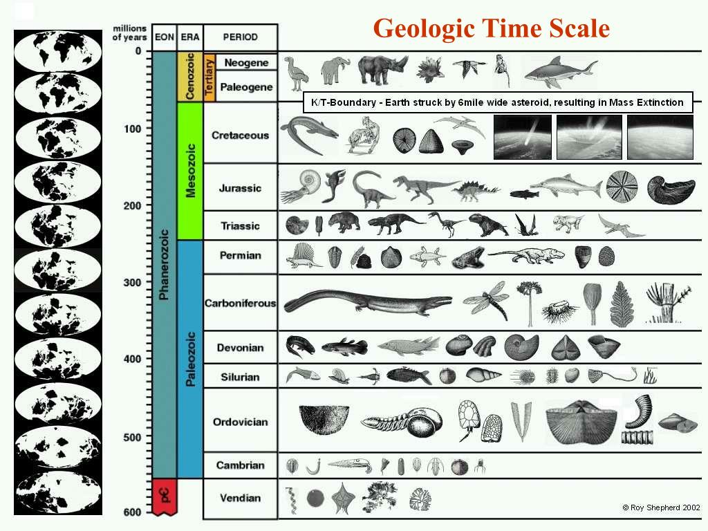 – this one has maps of how the continents looked at each period – a great addition to any infographic. However, the phylogenetic info is superficial, and being just pictures, hard to look up.
 - 2 skmonug.blogspot.com/2020/04/figure-79-sketch-of-evolution-of-plant.html
- this embeds detailed phylogenetic information, but just for one group of life ("plant forms")
- 3
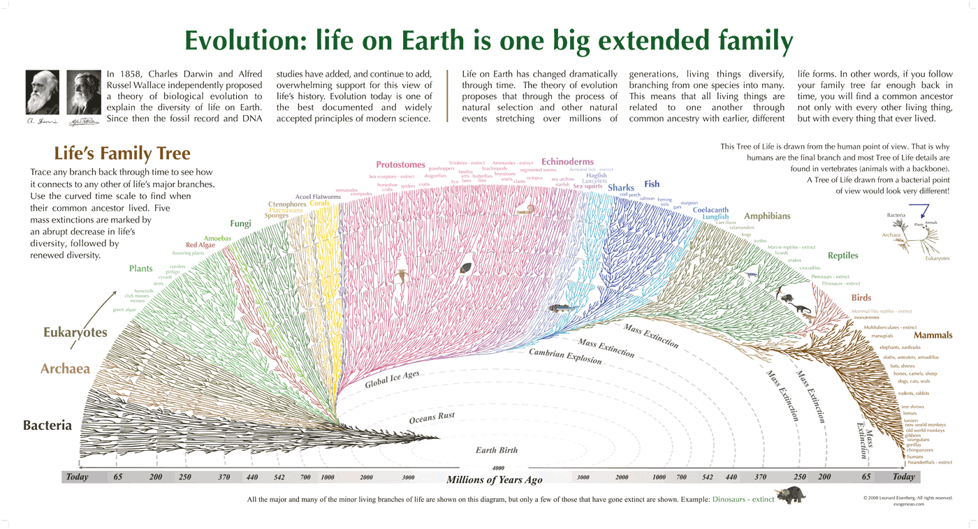
- Close but no cigar - the squiggly lines seem to be of artistic origin rather than mapping to known genera, the bacteria part should be as big as the eukaryote part, not all extinct genera are shown etc. But the concept is exceptionally well done.
- 4
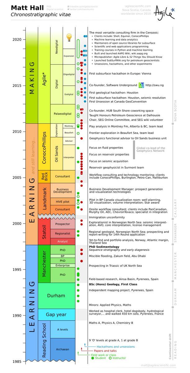
- not about geology at all, but very creative!
- 5 www.dailymail.co.uk/sciencetech/article-2982564/Tree-life-rewritten-Evolutionary-timeline-looks-like-giant-lollipop-reveals-new-species-appear-2-million-years.html
- yes! this is what infographics are about, enabling new ways to think
- 6 timetree.org/ – a data source
- good poster at timetree.org/book but full res needs $$$
- 7
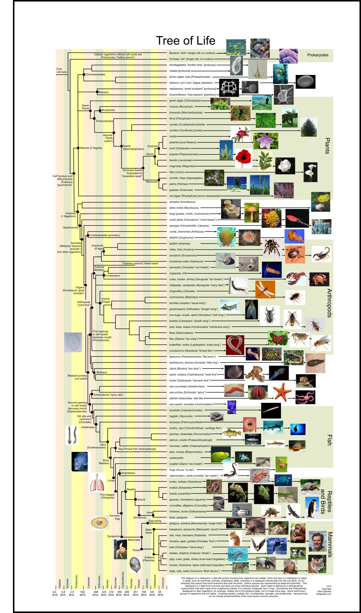
- great! it explains a bit e.g. organs, bilateral symmetry, arthropod "joint-foot", primates "first", first opening in cell cluster becomes mouth…
- you can tell that this one was made by an university student or teacher for learning/memorizing


World map🔗
Opinion piece
Almost every world map I've seen was basically just showing where each country is, plus maybe one other dimension of info (like GDP or temperature or topography).
Even "physical" maps don't succeed in showing much beyond topography and general climate, and there is often still an overwhelming focus on borders. And those that remove borders, don't take advantage of it, resulting in a info-poor map. Large regions appear to just be blank. Famous rivers like the Elbe are not shown. Maps that do succeed at showing things like the Elbe then proceed to not show any cities, so I can't see where e.g. Hanover is in relation to the Elbe. Come on!
Then you look at artistic maps, but then they seem to only care about making an artwork and forget to embed much info. Why can't a map be both artistic and a good place to look things up?
I'm also bothered by inappropriate coloring, e.g. when a "physical map" seems to say something about climate with its colors but actually is just colored by altitude, leading to the appearance that there is no greenery in high-altitude areas. I'd rather areas be colored more true-to-life.
The question of how to show altitude can be interesting, because I for one have rarely found absolute altitude enlightening. It's difference in altitude that would be more useful to know, and how mountainous an area is (how "spiky" the altitude), in a way that leads to actual difficulty to walk/bike through. In practical life, we don't recognize mountain by "height from sea-level", but by "height from surroundings".
One probably good way to deal with that is to use altitude lines, or by just artistically drawing mountains (as in fantasy maps) in areas where you would in practice notice them.
Don't show these on a map for God's sake
- Road and rail (these belong to the era of phonebooks, road maps and manual navigation)
- Borders
- Country names
Show more of these, please
- Rivers
- River names
- Small towns
- Named geo-features like peninsulas, valleys and forests – just try to look for Schwarzwald on a modern map, good luck!
- UNESCO sites
- Cultural stuff (not sure what)
- Frequently-active volcanic cones (fun for kids)
- persistent sea-surface currents
- marginal seas (e.g. Ligurian Sea)
- Some districts of big cities (not just a big "London" blob)
As a check, at a minimum, a map worth a cent should succeed at naming all of the following:
- various basins of the Sahara
- some towns inside the Sahara
- the Horn of Africa
- the Siberian Traps
- Honshu Island
- Torneälv
- Vindelälv
- The Elbe
- Birka
- Edinburgh of the Seven Seas
- The White Sea
- The Ligurian Sea
- Schwarzwald
A map should NOT bother to name
- any continent (everyone's taught the continents at age 7)
- any country (but maybe show island ownership)
- The Atlantic or Pacific oceans
- The Sahara
not sure if it should be a Dymaxion map, but it would be cool, esp. if it came in pieces that could be assembled into a rough-hewn sphere, or posted flat on the wall as you prefer
Other cool posters
What links here
- 2022-01-25